A Classic Paris Apartment Gets a Color-Blocked Update for Two Graphic Designers
Posted by admin on
Fresh out of architecture school, Hélène Pinaud and Julien Schwartzmann of Heju Studio made their mark by coming up with clever, well-designed DIY projects, such as a Brass Wall Organizer and Homemade Terrazzo Table. These led to Paris boutiques designs and the couple’s own kitchen upgrade using materials from the French equivalent of Home Depot: see Two Young Paris Architects Completely Redo Their Kitchen for Under $4,300. Their pleasingly clean-lined, pale-wood-meets-pale-pink style, in turn, earned Heju full-scale residential commissions, including this project for a young couple, both graphic designers, who have a one-year-old son.
Set in a classic Haussmann-style building in Montmartre, the one-bedroom apartment—775-square-foot—needed a new kitchen and bath, plus an additional bedroom—hence a layout rethink. And while the owners wanted to preserve original elements, such as the living room moldings, they also wanted to recast the rooms as bright and modern and interesting. In other words, they wanted the place to look and feel like them. Join us for a look at the colorful results.
Photography courtesy of Heju Studio.
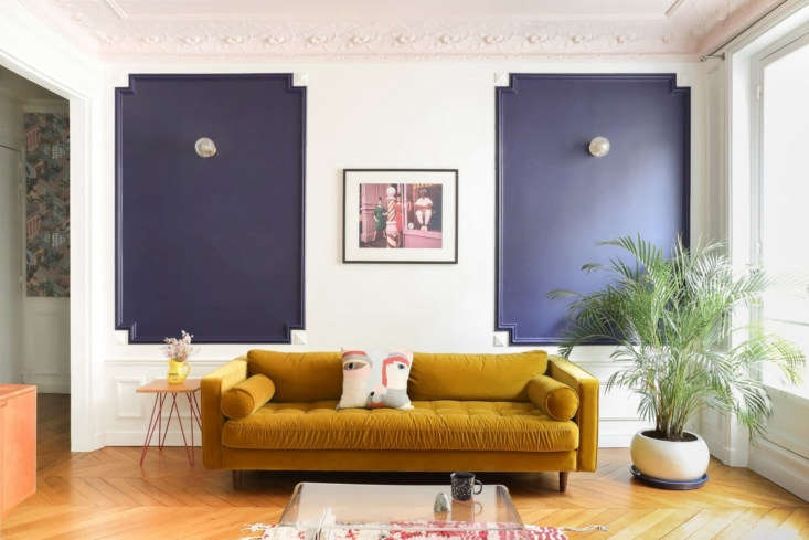 Above: “We approached this design like a graphic designer would do: with compositions of color and pattern,” Hélène tells us. The living room was given a new guise by calling out the picture frame moldings in a deep blue-violet from French line PaperMint.
The mustard velvet sofa is the Scott Three Seater from Made.com. Just outside the room, the front door is situated next to the wallpapered wall: “we’ve always loved Cole & Son’s architectural Miami pattern, but until now, our clients have always found it too busy,” says Hélène. Here, we used it in the corner to define the hall and create a small cocoon when you enter the apartment.”
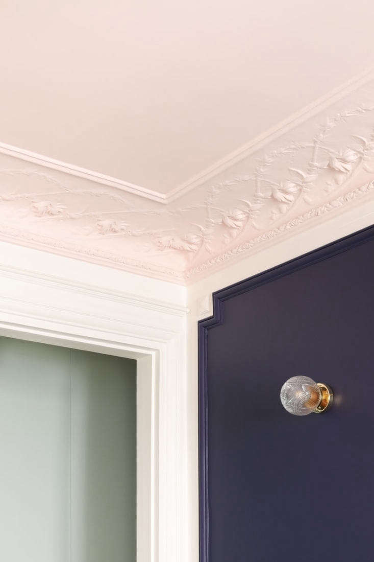 Above: The ceiling is edged with floral plasterwork cornices that verge on Art Nouveau, all now painted in Heju’s go-to Middleton Pink by Farrow & Ball.
Each of the room’s has its own palette but pastel pink threads its way as a link throughout.
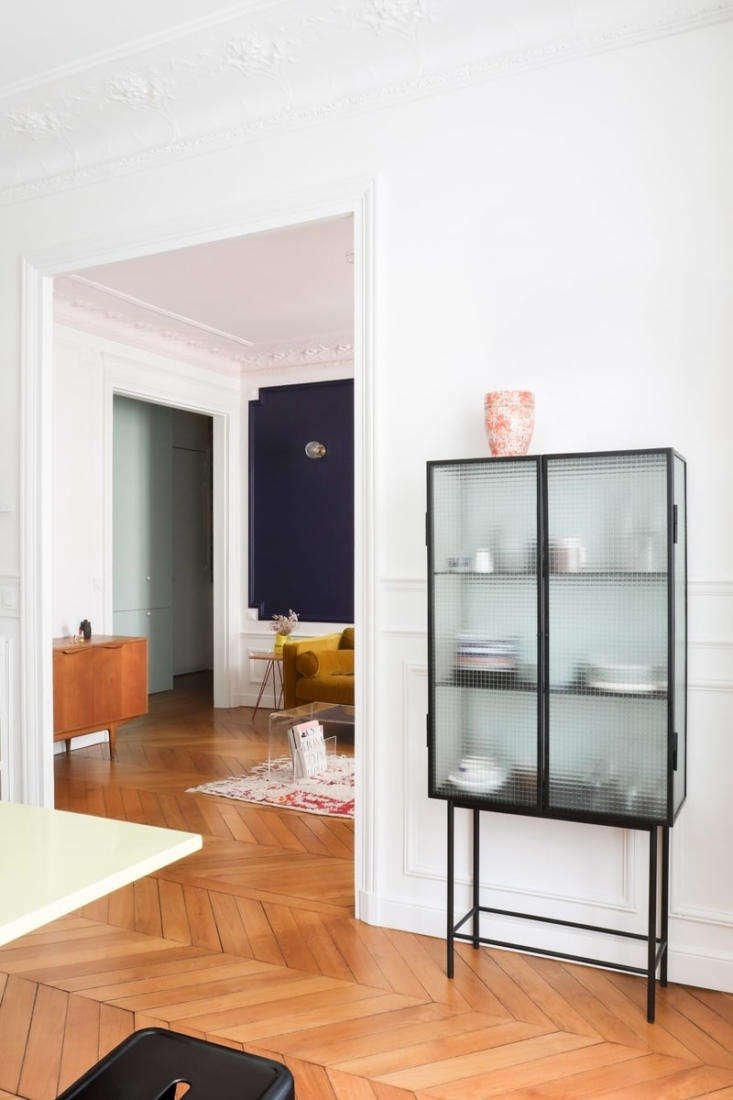 Above: The architects redesigned the former dining room as the new eat-in kitchen and widened the link between it and the living room. The chevron oak floor in dark reddish tones was newly sanded “to find its original color again,” and refinished with a matte varnish. (Intrigued by the pattern? See Remodeling 101: The Difference between Herringbone and Chevron Flooring.)
The fluted glass china cabinet is the Haze Vitrin by Ferm Living.
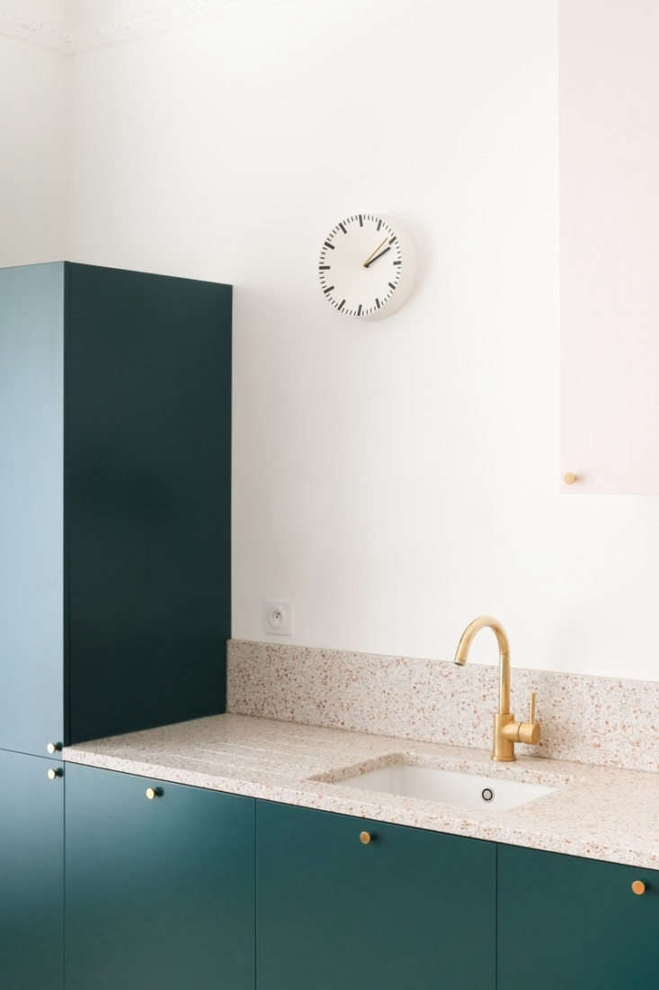
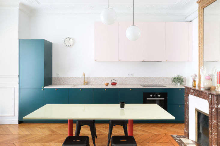 Above: The room’s original red marble fireplace and gilded mirror now stand against a color-blocked kitchen. “We designed the room as a graphic composition between vertical and horizontal rectangles,” says Julien.”We chose to use the same light pink as the living room ceiling, then we tried dark colors that contrast with it, and liked the way this green looks against the pink and terra-cotta.”
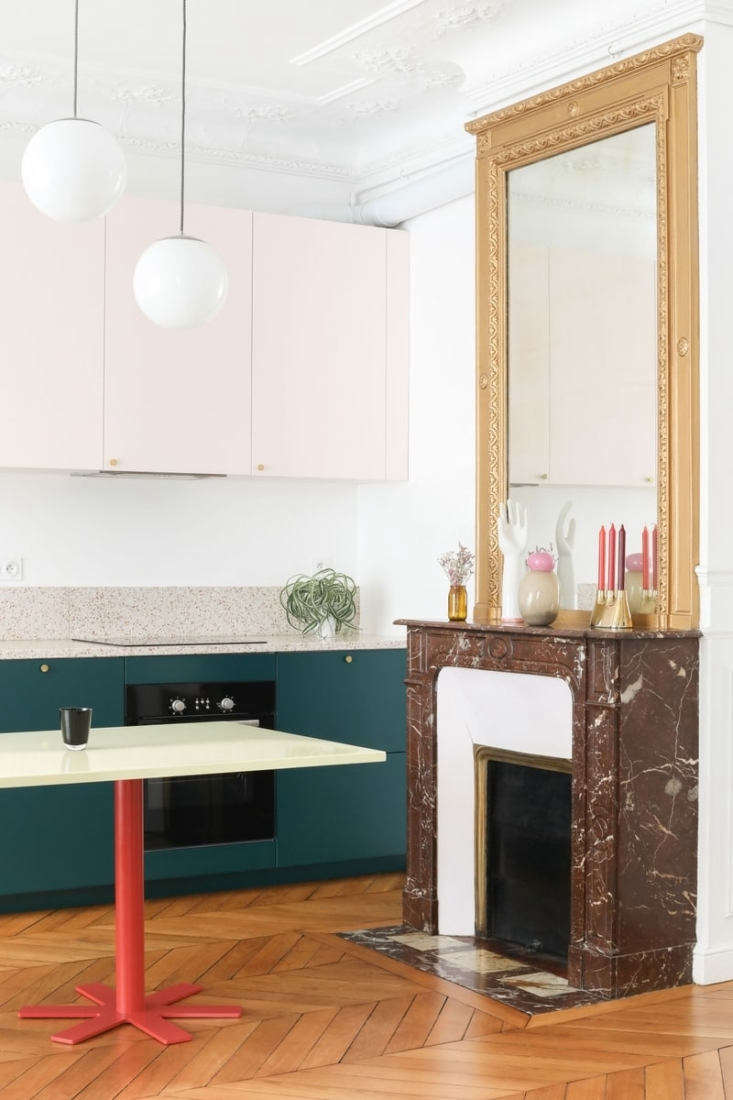 Above: The table, with an enameled steel top in pale yellow, is an India Mahdavi design called Parrot from French brand Petite Friture.
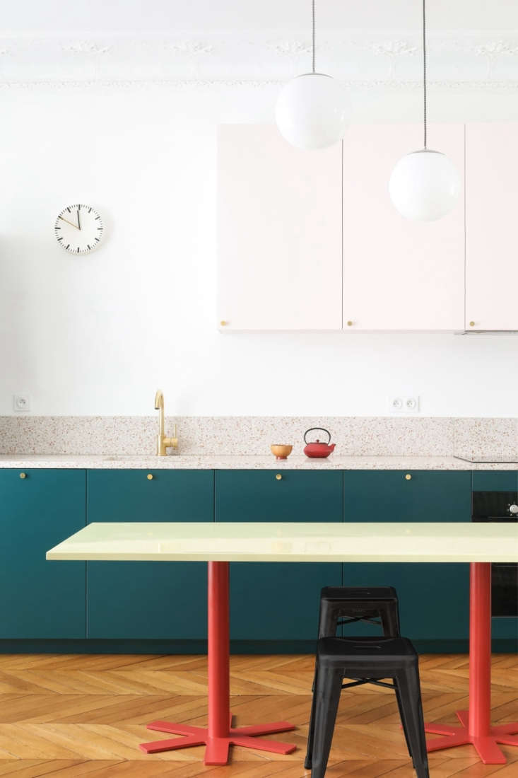 Above: Tolix stools serve as unobtrusive seating.
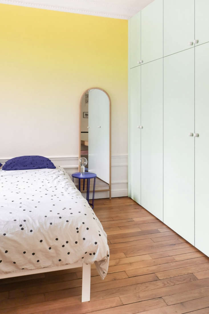 Above: The master bedroom is cloaked in an ombre palette courtesy of Sunset wallpaper from Bien Fait. The architects’ cleverly designed the room’s pale green closets as an extension of the cabinets next to the front door (where they contain, among other things, a washer/dryer). The dotted bedding is from French line La Cerise sur le Gateau.
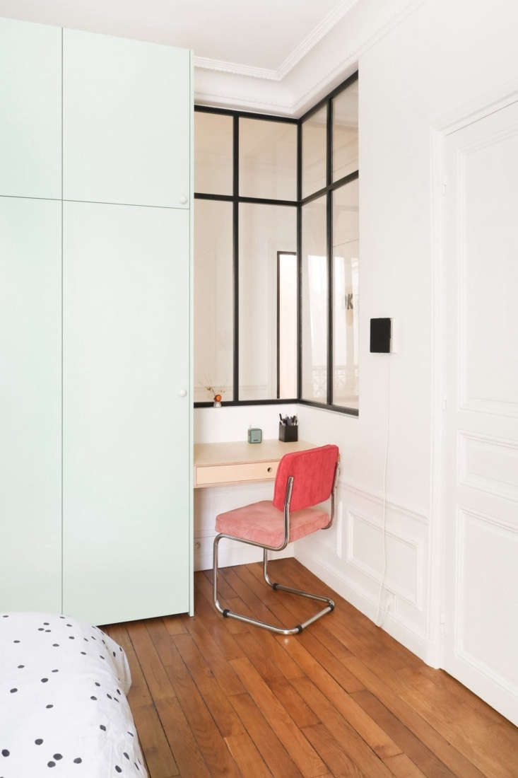 Above: Hélène and Julien tucked a work niche next to the cabinets, and inserted an interior corner window that visually enlarges the space and brightens the hall. “The goal was to forget the wall between the two and see the continuity through the interior window.”
The pink desk chair is from a limited edition series by Goodmoods —says Julien, “it’s inspired by Breuer’s Cesca chair but in a seventies style.”
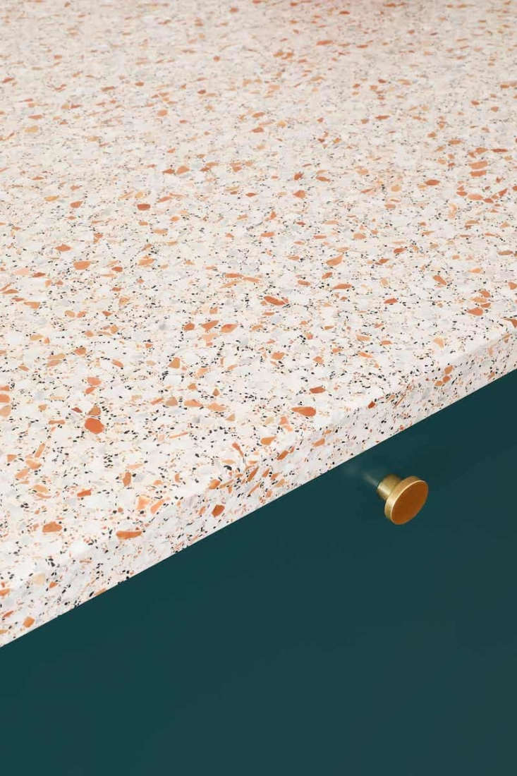
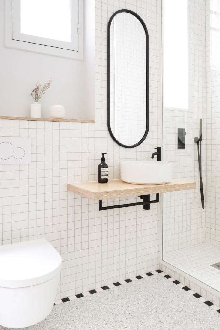 Above: “It’s a small bathroom, even for Paris, but it has two windows,” says Hélène. “We decided to create a Memphis-style design and to make the space look bigger, we defined two areas: the terrazzo floor, framed in black and white, is an echo of the kitchen countertop, this time in gray, and the walls are lined with square white tiles.
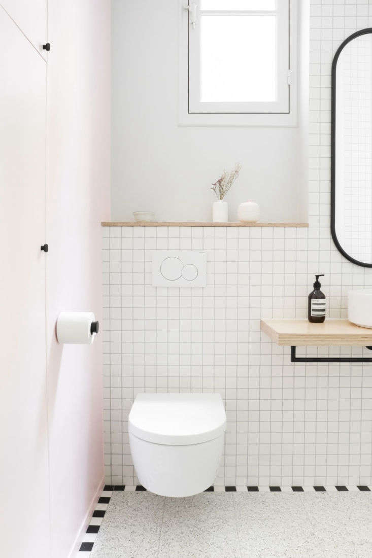 Above: Pale pink reappears on the entry wall. To keep the space feeling open, the architects selected a wall-hung Villeroy & Boch toilet and designed a birch ply shelf for the sink “so both are suspended and the floor is the main element.” The black hardware, toilet roll holder included, is from Paris department store Le BHV. The oval mirror is the Angui by AYTM.
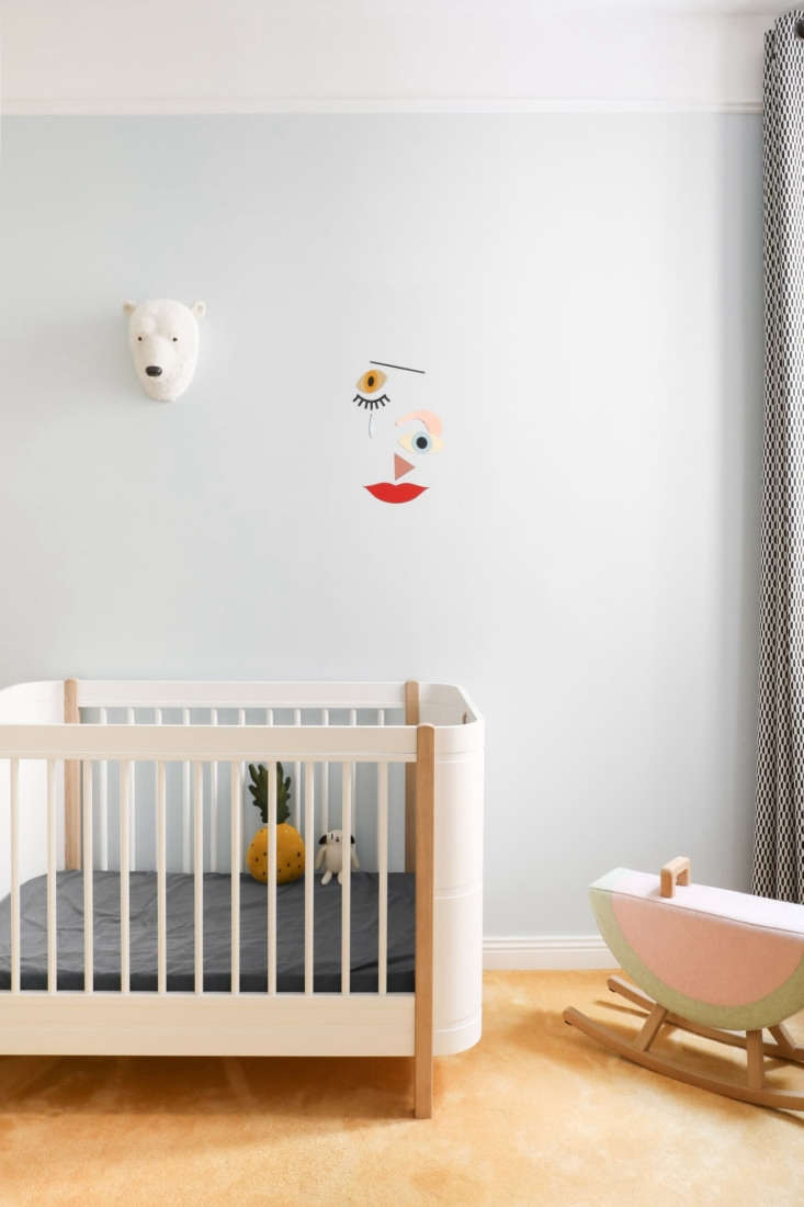 Above: The former kitchen in the back of the apartment was transformed into the baby’s room. Here, the architects’ introduced simple new moldings and wall-to-wall mustard carpet (“we didn’t want to put in a new wooden floor that didn’t match the old one and we liked the carpet’s vintage look”).
The light blue on the walls is Averse from Ressource: see Sexy Paint Colors from Paris. The crib is from Oliver Furniture of Copenhagen and the Wooden Expression Mobile is by Djeco. The watermelon rocking horse is from Maison Deux.
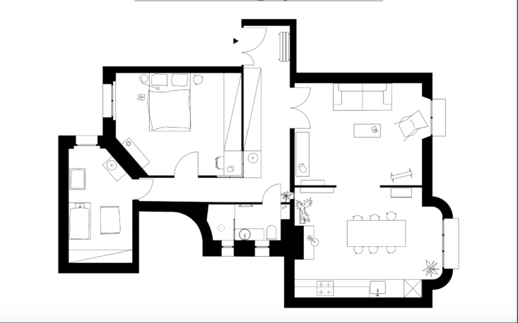 Above: The new floor plan—775 square feet in total—has a more logical flow, with the living room and kitchen/dining area linked and the bedrooms side by side in the back. The architects gained more space for the tiny bath by reducing the hallway a bit and sealing the door between it and the dining room. The construction took three and a half months.
For another Paris apartment with eye-opening colors, see A Model at Home: A Loft Inspired by Josef Albers.
More DIY projects by Heju:

